Today's society is an era of Internet plus. Computers and the Internet have become essential companions in our life. The network has become a convenient tool for us to obtain knowledge and information. As a contemporary new youth, understanding network knowledge is our normal life. Only when you understand it can you operate it better. Today I will share some DIV + CSS web design experience here.

DIV + CSS is used in web page design and production. Its greatest advantage is the standardization of web page codes. DIV + CSS abandons outdated table layout. The separation of content, performance and behavior is realized. It is better structured than HTML code and easier to read and maintain. Web page files are smaller in size. Through perfect typesetting, the web page can be beautified. This can streamline the web page and make it more convenient for users to browse the web page.
DIV + CSS and TABLE are different in design. The web page needs to be planned before it starts to design. You need to name the elements that make up the web page. This facilitates style definition in CSS. The public attribute part is best defined by the class name. Styles common to the entire website can be put into a separate CSS file. Common public attributes are as follows. Web page width, background color, background picture, font default size, color, link style, etc. The different styles of each web page are best put together in CSS files. You should mark which web page or part of which web page these documents are. This not only reduces the CSS file size, but also avoids confusion. You can maintain it faster. Do not embed styles in Web page code. Completely realize the separation of content and style.
If you want to do a good job in DIV + CSS web page design and production. You need to understand the following three points:
1. Float attribute: DIV (layer) occupies an entire row by default. For the design of common two-column or multi-column layout, it is necessary to be able to correctly set float and width attributes to realize the effect. After the multi-column layout is completed, if there is a layer occupying the banner. You need to set the clear property to clear layer floats.
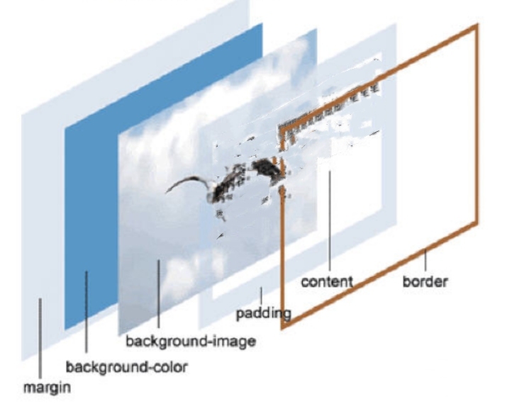
2. Box Mode: The layer has many attributes. Width, height, border, inner spacing padding, outer spacing margin, etc. The actual space occupied by the layer is the sum of the above attribute values. Reasonable use of these attributes can achieve compact and beautiful web page layout.

3. Layer Nesting: Experienced web designers know that too many layers should not be nested. It does not exceed 3 floors. Too much nesting will lead to complex code redundancy, difficult maintenance and slow operation. The multi-column layout can be implemented by layer floating. There is no need to set up an IE layer as a whole to embed.
This is my experience in DIV + CSS web page design. What is introduced here is simple knowledge. If you want to make a better web page, you need to continue to study deeply. Making web pages cannot be done by one person. It needs everyone's discussion.