Update: Google Nexus 6 is no more

Google's Nexus 6 is no longer on sale following the Pixel launch. The now two-year-old handset is officially dead and buried with Google pushing all its efforts into its fancy new flagship, the Pixel.
New units are no longer being manufactured, but there are a handful of Nexus 6's doing the rounds on reseller sites such as Ebay for super cheap should your heart be set on getting one. The Nexus 6 is still a reasonably solid choice, and a recent update should see it running Google's latest version of its smartphone operating system, Android 7.1 Marshmallow.
That being said, here is my original Google Nexus 6 review.
Google Nexus 6 review
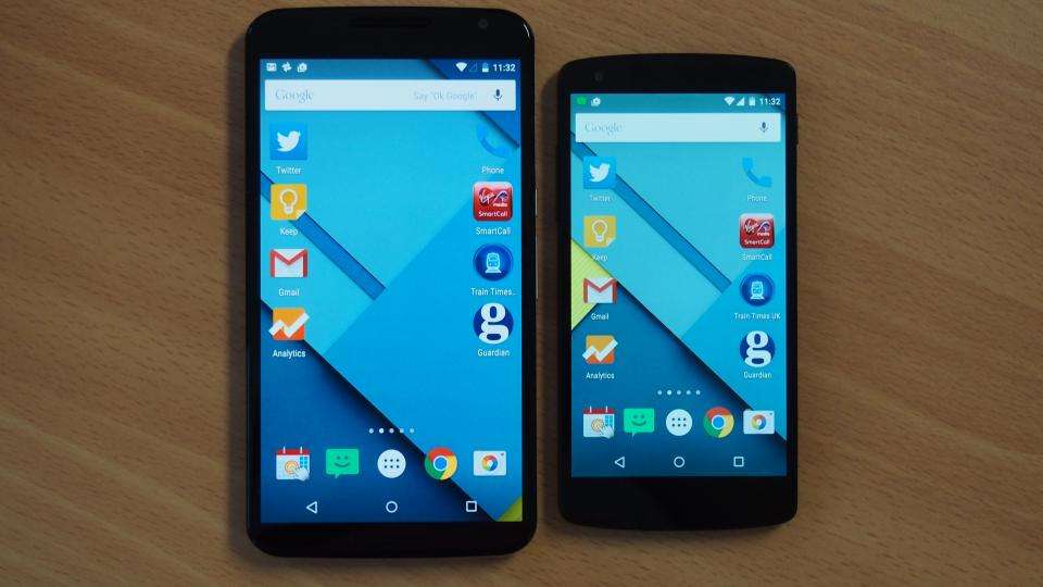
Google’s Nexus brand is a fickle beast, hopping from one manufacturer to the next. After a successful stint with LG, the latest recipient of its blessing is Motorola. That makes some sense as the company was Google-owned until its recent shift to Lenovo. The Nexus 6 is undoubtedly a Motorola device, being a dead ringer for the excellent Moto X (2nd Gen) . It’s bigger, though, much bigger. Its titular 6in screen puts it among the largest smartphones we’ve ever seen, bigger even than the Samsung Galaxy Note 4 at 5.7in.
It was also one of the first smartphones to get Android 5.0 Lollipop and, since launch, one of the first devices to get the point upgrade, Android 5.1. As a result, we've since updated this review with our observations of Android 5.1, plus we've run our new benchmarks on the phone to see how fast it is with the software upgrade. All existing Nexus 6 owners can upgrade to Android 5.1 now, with the OTA update available.
Design
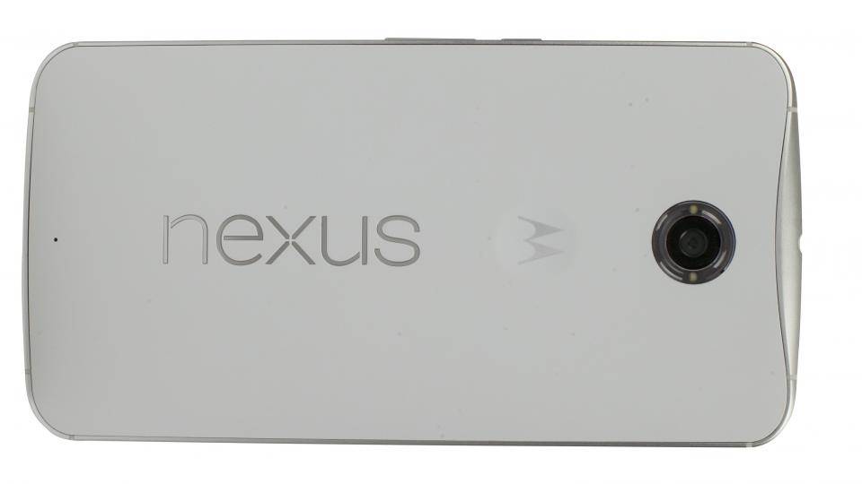
We’ve already waxed lyrical at length in our admiration for the new Moto X’s design, and the same applies here. The rear is a delightful collision of lines and curves, all tapering to narrow edges that terminate in an aluminium frame. It feels very tough and rigid.
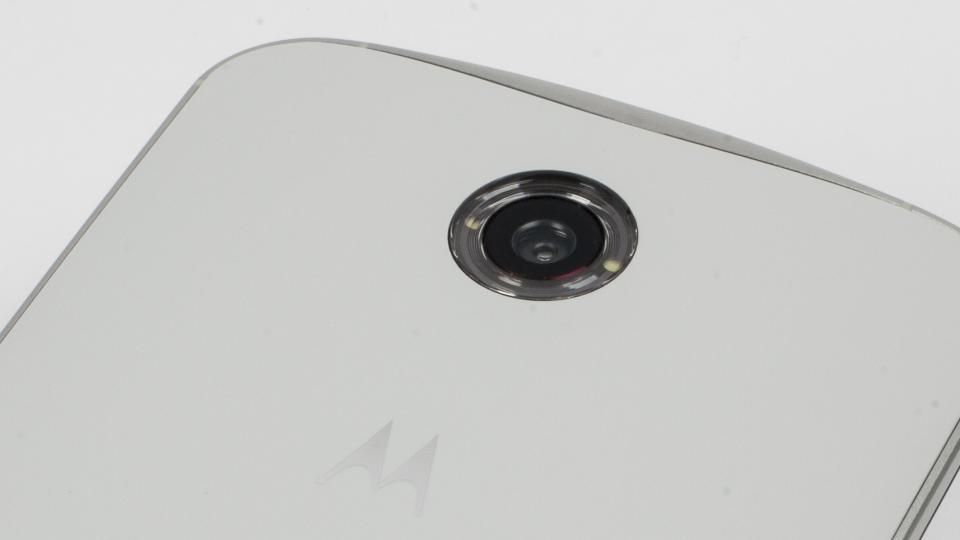
The smooth, slightly soft rear panel is a pleasure to hold. The headphone socket, camera lens, Motorola and Nexus logos, and the USB port all fall perfectly in a line down the centre of the handset. The ridged power button sits neatly under your forefinger; you’ll need it, too, as there’s no double-tap to wake, which we saw on the HTC Nexus 9 tablet .
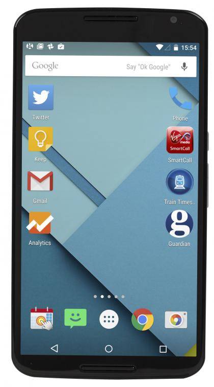
The front of the phone is a gloss black and largely featureless. There are slim bezels, around 3.5mm, on either side of the screen. At the top and bottom are forward-firing stereo speakers, for watching videos in landscape aspect, but despite this there’s still little in the way of bezel above and below the screen.

There are no physical buttons here, as on Galaxy handsets or iPhones, with everything dealt with using onscreen buttons instead, which we prefer. There’s no rim or edge around the screen either, it simply curves away to meet the metal frame on the edge. The screen is protected by Gorilla Glass 3 and so should stay largely scratch free, it has a slightly more resistant feel when you slide your finger over it than usual, which might bother some.
In terms of measurements, the 6in screen makes it understandably a bit larger face-on than the 5.7in Galaxy Note 4 - 159x83mm compared to 154x79mm. On paper, it’s a tad chunkier as well, being 10.1mm deep compared to the Note 4’s 8.5mm. In practice, there’s nothing in it, with the nexus 6’s slender edges and subtly bulging rear panel feeling just as slender as the Note 4’s slim slab.
Of course, the sheer size will put some off. Our largest members of staff found they could still grasp the phone one-handed and reach across the display, but not to the opposite corner. Your average person is really looking at using this two-handed, especially given there’s no provision made to one-handed use, as with the resizing screen options provided by both the Note 4 and iPhone 6 Plus.
Display
However you tackle it, the screen is truly huge at a massive 6in across. The AMOLED display has the now-typical, but still absurdly detailed, 2,560x1,440 resolution we’ve seen on the Note 4 and LG G3 . The sheer screen size does drop the pixels-per-inch figure to a 'mere' 493ppi, which is a tad below that of those other handsets, but not noticeably.
As important as raw resolution claims are the number of subpixels being used for each claimed pixel. The Note 4 uses Samsung’s latest AMOLED technology, which utilises a new diamond-shaped pixel structure, with fewer of the larger red and blue pixels and more of the smaller green ones. The Nexus 6 looks to use an older subpixel structure with simpler bar-shaped subpixels. In practice, that means the Note 4 is slightly sharper-looking. We’re splitting hairs here though, given how fine the detail is on both screens.

Colour is a far bigger issue for the Nexus 6. AMOLED screens have long suffered from inaccurate colour reproduction compared to their LCD cousins, although that has been offset by their far superior contrast. Now the two are converging, with contrast improving on LCDs and the Note 4 showing itself capable of good accuracy; largely thanks to multiple colour temperature settings, of which the ‘Basic’ setting accurately tracks sRGB.
After that, the Nexus 6 is a big step backwards. Despite having 100% sRGB coverage, the colours are way off the sRGB standard in our tests, being far too saturated and garish. Purists will hate it, but those who like their TV sets as they come from the shop, full of vibrant hues, won’t be overly put off. In our experience, most people prefer something a bit livelier and warmer than sRGB but this is still over-egging it somewhat.
All that said, it’s hard not to enjoy watching downloaded iPlayer shows on the 6in display on the commute. A peak brightness of 286.91cd/m2 is slightly brighter than the Note 4, giving it the edge in terms of AMOLED screen brightness. For those who watch a lot of video on the go, or who want to watch around the home without reaching for a tablet, this is a satisfyingly big screen, with deep blacks and plenty of detail.

^ It's not easy to see the difference here, but you should be able to make out the oversaturated red/orange shades at least, in real life it's far, far more pronounced
Speakers
The Nexus 6 has a pair of forward-firing stereo speakers, with one on each side of the screen when it's in landscape mode. We've seen such speakers before, mainly on HTC's handsets, and they're always welcome. In portrait mode, the upper speaker also doubles up for as an earpiece for voice calls, while the lower one integrates the microphone, keeping everything very neat.
The volume is well graduated with lots of options in the middle of the range, and then fewer at the low and high ends, which makes practical sense. Audio quality is way ahead of anything with bottom- or rear-positioned speakers. It main rival is the HTC One M8 ; the M8's speakers were more balanced with more lower-mid, but the Nexus 6 was louder and sounded more expansive. It's hard to pick between them here, but for watching video clips the huge 6in screen on the Nexus wins out anyway.
^ The front-firing speakers hugely increased our enjoyment of movie trailers and the like