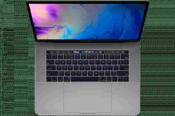
I wanted to love the MacBook Touch Bar, I truly did. I thought the raft of people complaining about it just weren’t ready to see the big picture. Even if there were some teething problems, Apple would fix them, right?

No. I was wrong. The MacBook Touch Bar fucking sucks. Sorry, people I doubted.
First off, a little bit of context and history. The MacBook Touch Bar (first unveiled in October 2016) is basically a touch display in place of the old function keys. This means that rather than having a stationary button for, say, changing the volume, there’s a customizable strip that alters depending on the app you’re using.
You probably know exactly what I’m talking about, but here’s a useful breakdown in case you don’t:
If you’ve got this far, I assume you have one question: Why? Why now? Well, I recently got a new MacBook Pro with a Touch Bar — meaning I’ve been using it every day. In those simpler, pre-Touch Bar days, my experience with the technology was just messing about on other people‘s machines.
“It’s cool,” I’d say tapping at the Touch Bar with a filthy finger, “it’s basically a tiny touch screen… on a MacBook — what a world!”
“Yeah, but it’s annoying and doesn’t work well. Also please stop touching that,” I’d hear from someone who actually used the MacBook Touch Bar, before ignoring them and continuing my life in blissful ignorance.
So why does the MacBook Touch Bar suck so much?
There are two main reasons: Usability and reliability.
Since the MacBook Touch bar has been in my pathetic, needy life, it’s forced me to consider what I used the old function keys most often for. Predominately, changing screen brightness and volume. It was a feature I rarely thought about, as I could alter either with a single click. But, obviously, my life was too good back then.
With the Touch Bar, there are only four anchored options. This means you can select four functions (such as lock screen, play, or pause) that remain on the strip. The rest of them change depending on the app that’s currently in use.
What does this mean in reality? Well — dependent on your set-up — it now can take two or three clicks on the MacBook Touch Bar to change my fucking laptop‘s volume.
This can be changed, but requires a dive into some settings. What this doesn’t change though is how often I brush against that touch strip and press something I didn’t mean to.
If, somewhere deep in the basement of Apple‘s headquarters, a crack team of headphone jack-removing, lightning cable-creating monsters tried to come up with a lowkey way of making my life shittier, this is the exact sort of thing they’d do.
So, uh, congrats?
And what about its reliability?
Have you ever thanked a button? Take a moment, right now, to lean towards your nearest physical switch, caress it with your fingertip, and whisper “cheers for your help, bud.” Feels good, doesn’t it?
I don’t wanna sound like a boomer — which, of course, means that’s exactly what I’m going to sound like — but you know where you are with a button. It’s a constant, like the sunrise and turtlenecks. You click a button and, more often than not, the thing you want to happen, happens.
Now, don’t be alarmed, but touch screens aren’t buttons. And while some of them are reliable (I rarely have issues with my iPhone, for example), the MacBook Touch Bar is most definitely not.
Since getting the laptop a couple of weeks ago, the Touch Bar has become unresponsive on a number of occasions — meaning I’ve had to reset it. A reset that happens after I’ve tried tapping the stupid thing a thousand times, leaving it alone in the hope it’ll fix itself; repeating these two steps until I lose patience and open up Activity Monitor.
It’s not a huge issue, but it is annoying. I’m on my laptop all day, the last thing I want it to do is annoy me. I’d like it to sit quietly and politely do what I ask. Not crash hinder me from making my screen brighter.


So Apple should just remove the Touch Bar?
Here’s the thing: The technology has potential. But people have been saying that for the past three years. At this point, we should be in the peak of its use, the kinks and issues should be ironed out, and we should be surfing the internet using the MacBook Touch Bar as some sort of water-based board — I’ll get back to you on the name.
Instead, it seems that playing Doom on it is about the limit. That’s cool and everything (who doesn’t like Doom ?), but I’d prefer it if my laptop was still easy to use. Currently, all the company has done is make virtual buttons that are worse than normal buttons.
To me, it all comes back to Apple’s focus.
I’ve written before of my wish that the company would whole-ass its MacBooks , but that’s unlikely to happen, especially when its revenue is concentrated elsewhere . At the very least, I feel the MacBook Touch Bar could be made more reliable, or some dev time put in to make it as useable as, you know, normal buttons are — but don’t fucking bet on that happening.
The situation is almost a dystopian joke: A company replacing perfectly functioning normal buttons with virtual ones because… it’s the future?
Truly, I wanted to love the MacBook Touch Bar, I really did. Instead, I’m going to spend the next five years complaining about it. Occasionally, I’ll write an article like this, something begging for Apple’s attention. You know, like a digital Oliver Twist, but much more depressing — because he didn’t pay for a $2,000 laptop with virtual buttons.